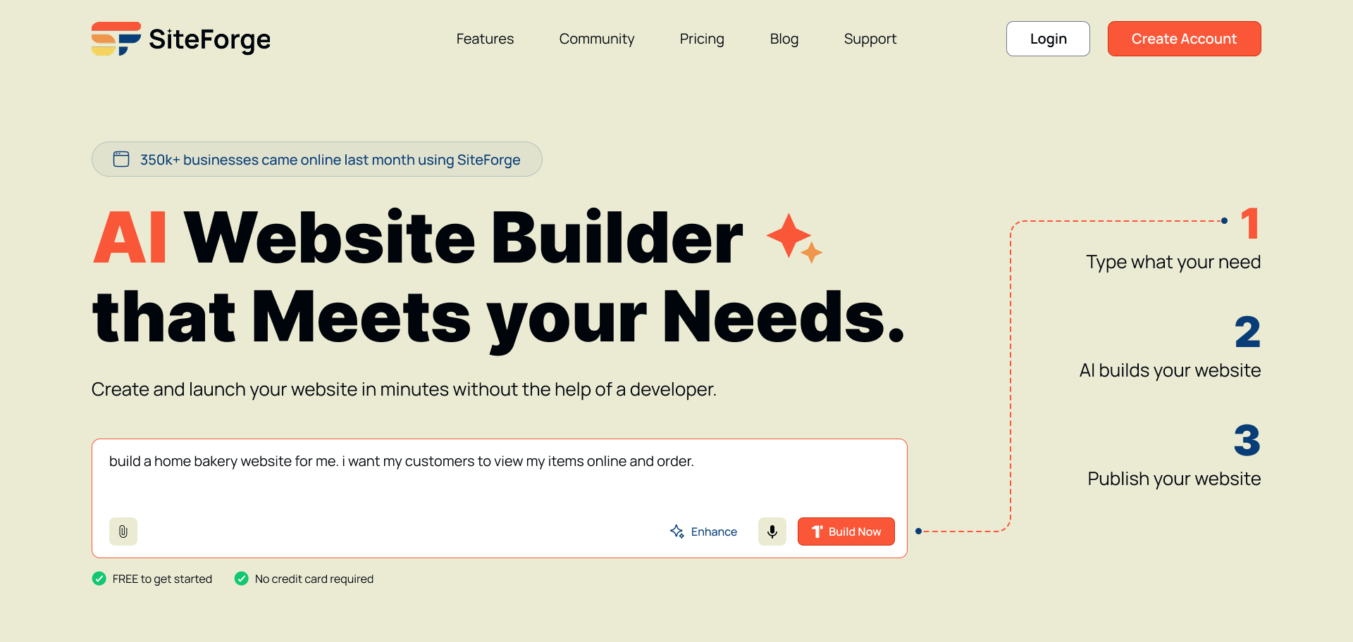
From “I need a website” to live, in one sitting.
SiteForge removes the friction of building a website from scratch. Instead of picking a template and staring at an editor, people describe their business through a guided AI conversation — and SiteForge generates a complete, branded website for them.
As the UX designer, I owned the end-to-end experience: the waitlist landing page, onboarding, AI generation, visual editing and publishing.
Website builders ask non-designers to think like designers.
Existing tools are either too rigid (templates) or too complex (endless customisation). For first-time creators, both roads end the same way — they give up.
- Too many choices. Non-technical users feel overwhelmed by traditional builders.
- The blank canvas. Starting from nothing causes decision fatigue and high onboarding drop-off.
- Words and style. People struggle to write compelling copy and choose a consistent visual style.
- The learning curve. Drag-and-drop editors discourage first-time creators.
Users don’t want more features — they want a confident starting point.
The biggest drop-off happens in the first three minutes, when people face a blank editor with no direction. An AI-guided onboarding meets them where they are and does the heavy lifting.
I audited seven AI builders to find where they fall short.
I mapped each product’s onboarding flow, AI capabilities, editing experience and publishing friction. The gaps shaped every core decision behind SiteForge.
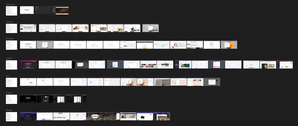
Opportunities this revealed
- Keep onboarding light — shrink the distance from first touch to first generated website.
- Avoid overwhelming interfaces — show only what’s needed, when it’s needed.
- Impressive by default — modern, high-quality layouts straight out of the box.
- Refine progressively — simplify options after generation, not all at once.
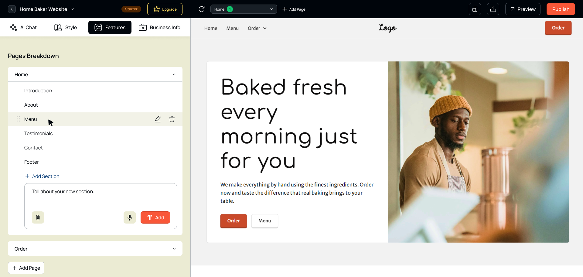
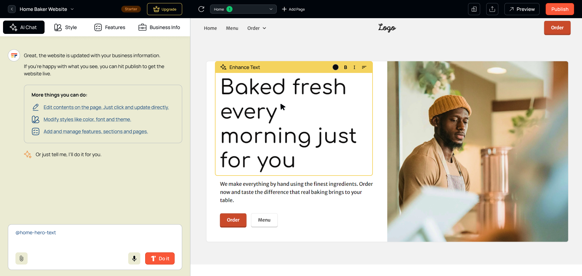
- Edits anyone can make — change anything, confidently, without design skills.
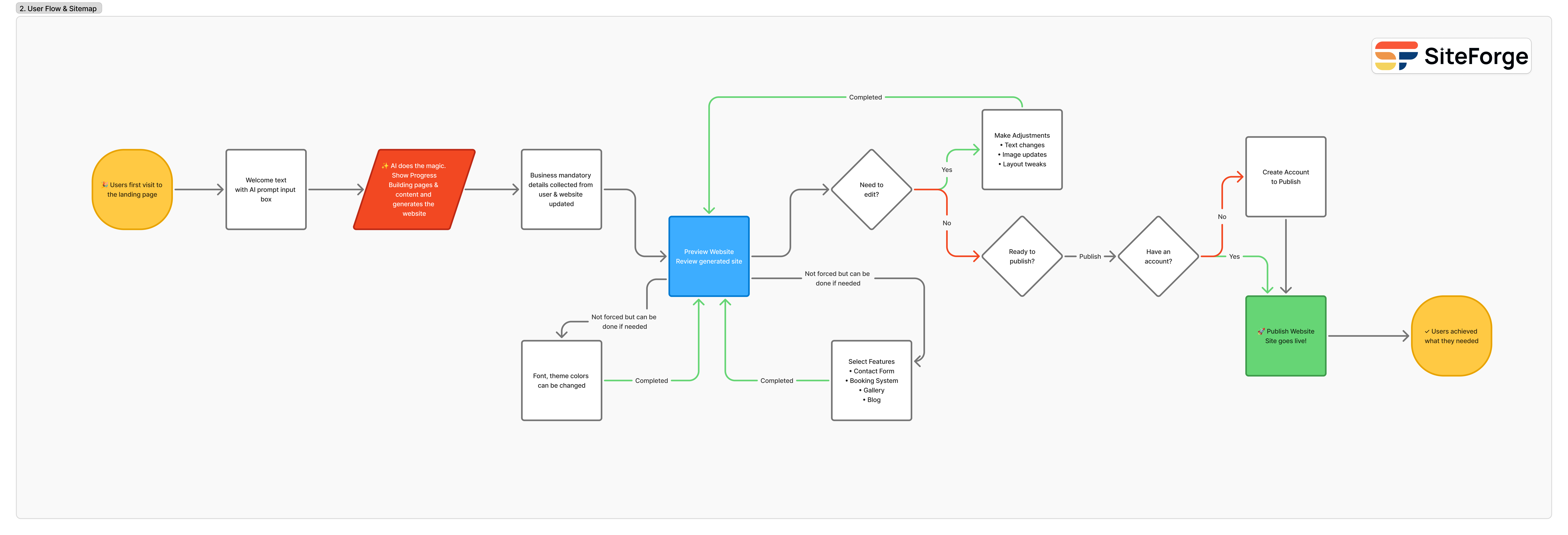
No blank-canvas moments, anywhere.
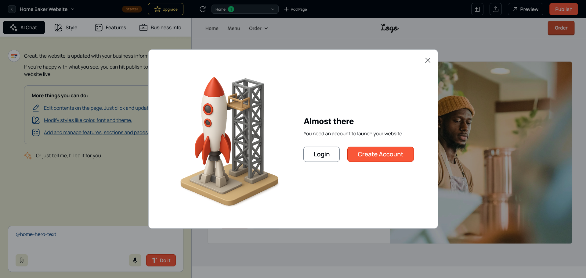
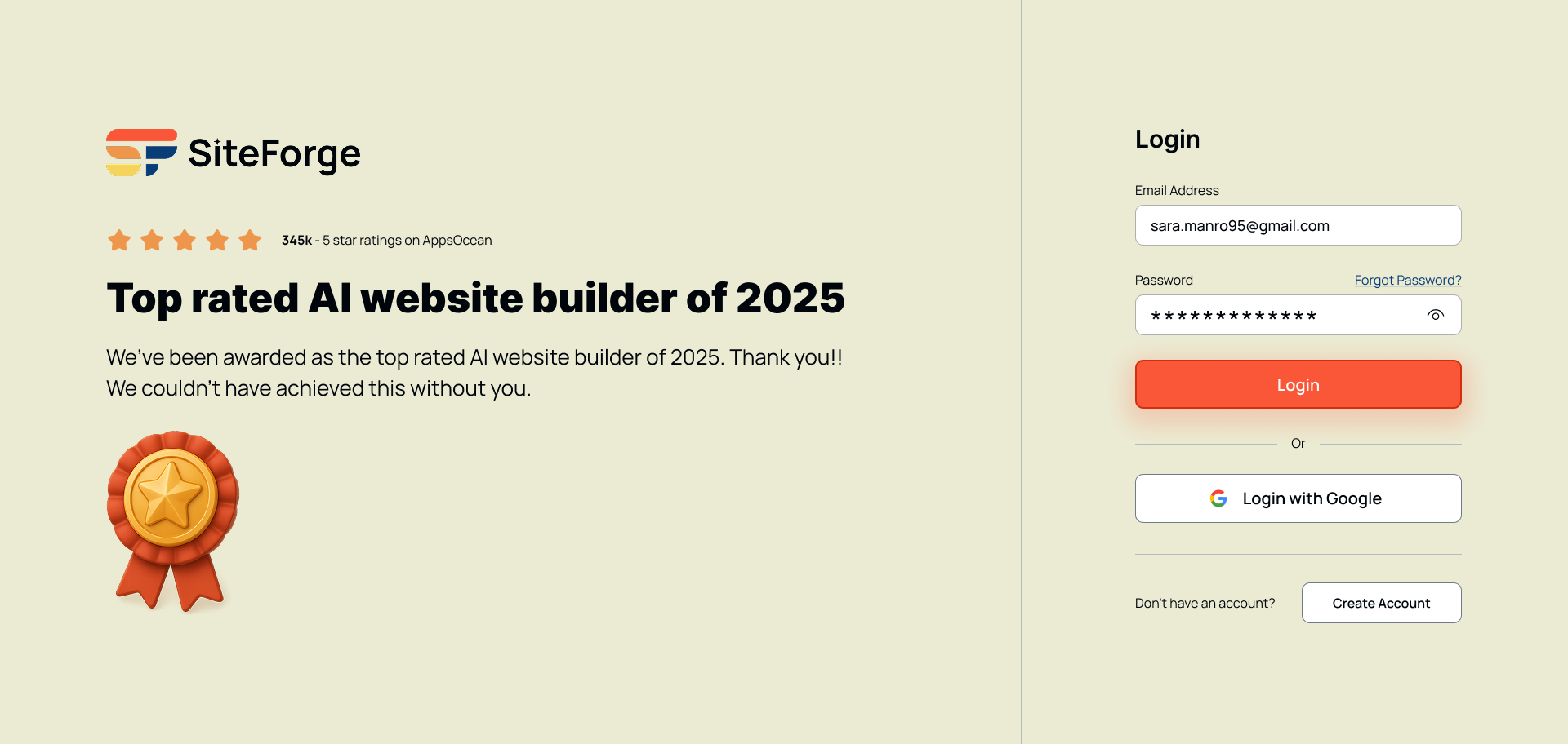
Every step keeps the user in a confident, guided state. Notice where account creation sits — after people have seen their website, not before.
Warm, energetic, and quietly confident.
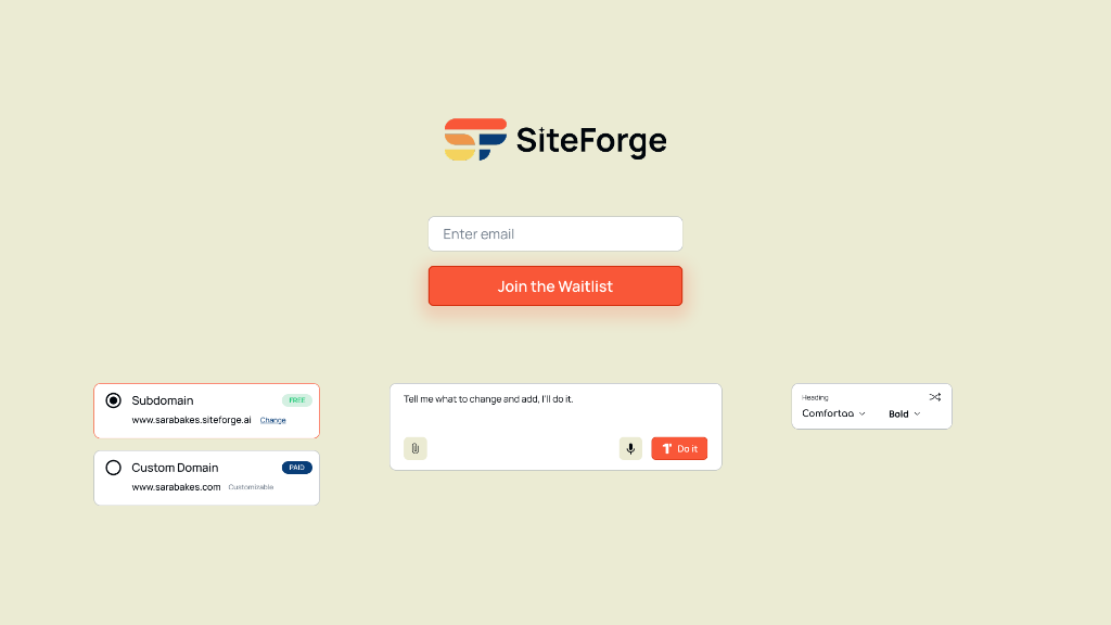
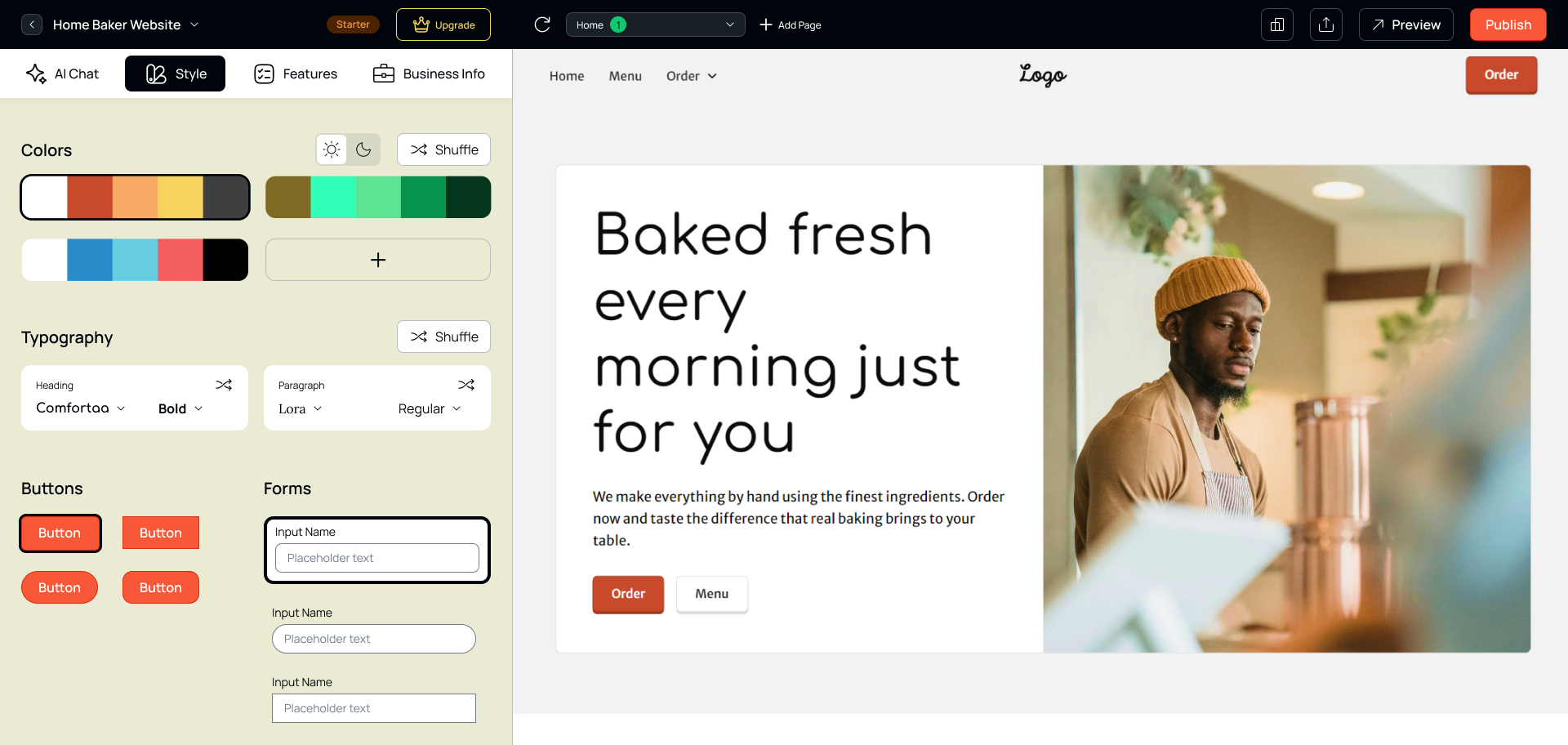
Before any screens, I set SiteForge’s identity: a warm palette that feels approachable rather than technical, and a clean type system — Inter for headings, Manrope for body.
Inter — headings. Tight, clear hierarchy.
Manrope — body. Friendly, optimised for readability.
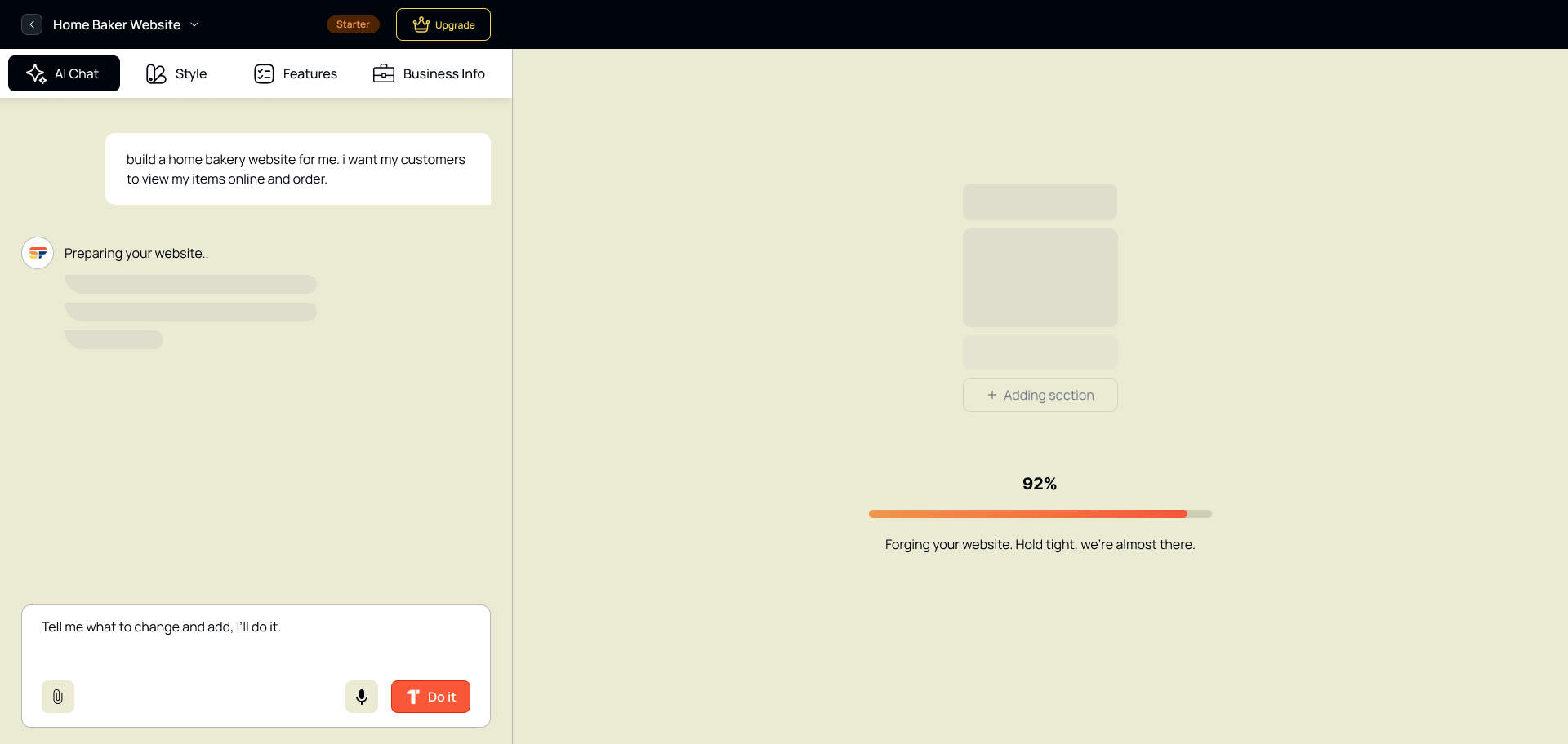
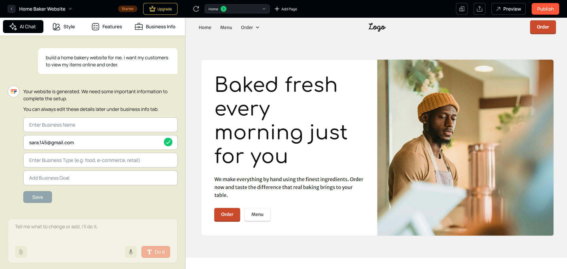
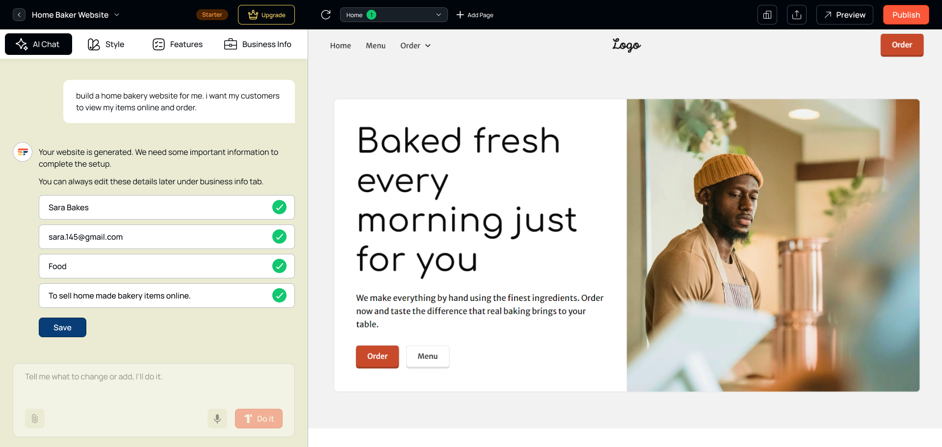
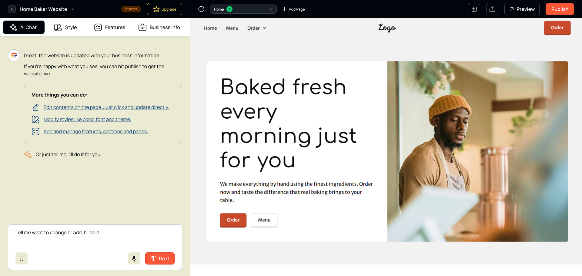
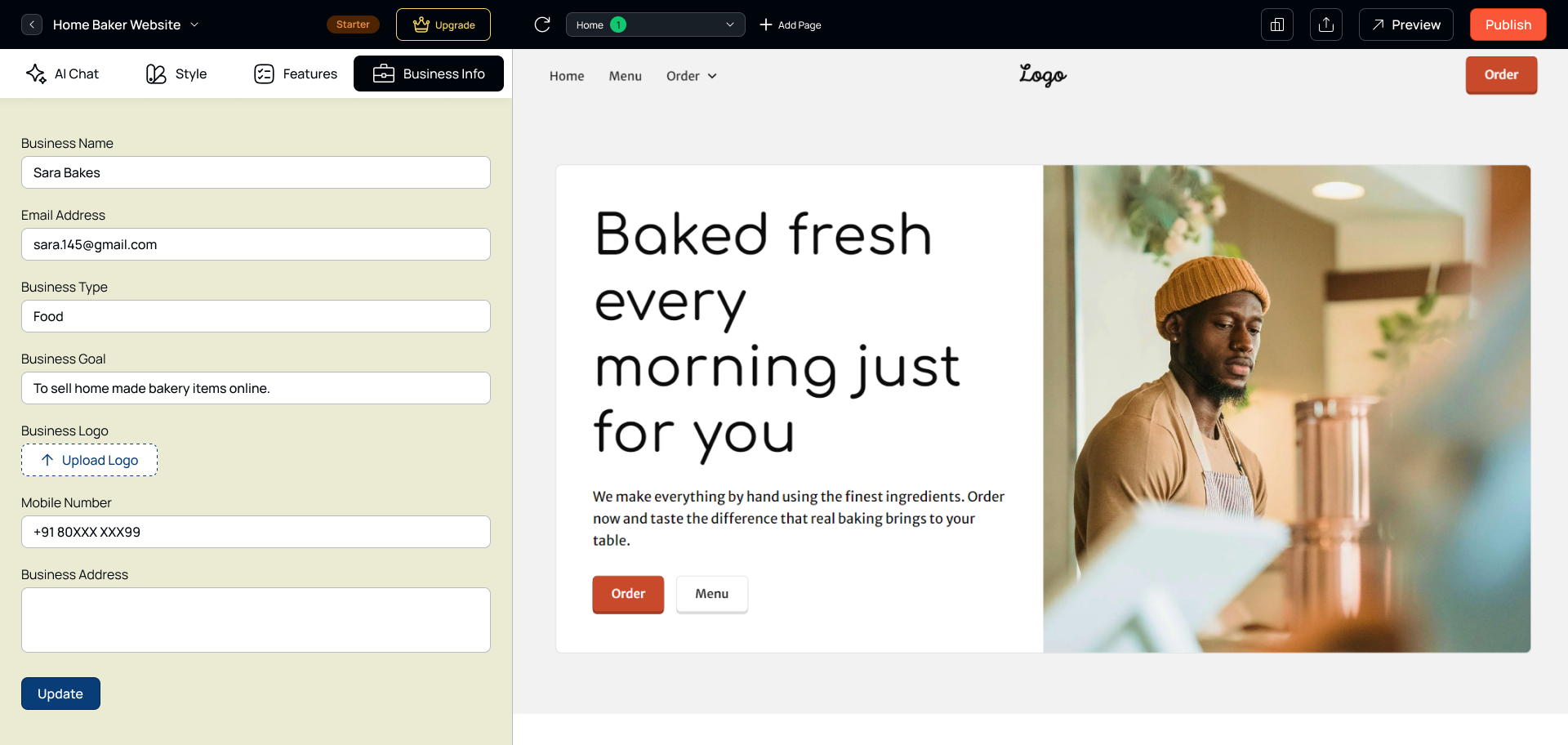
Thirteen screens, one confident journey.
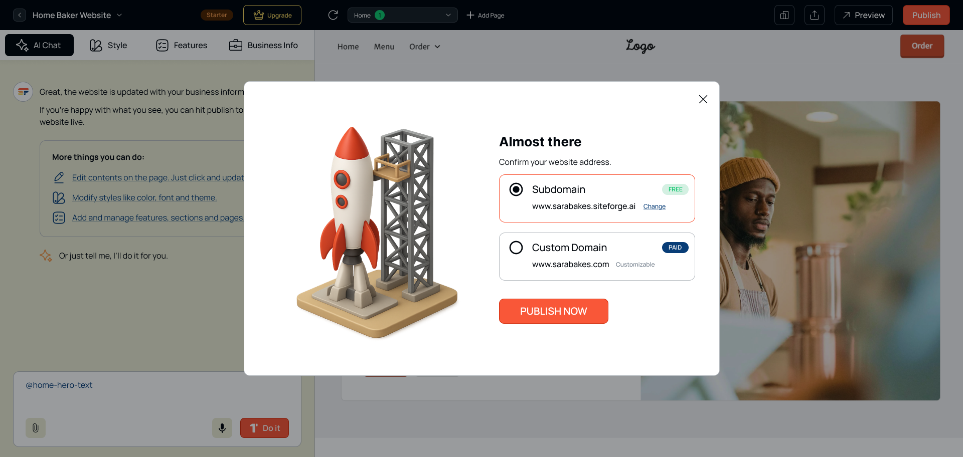
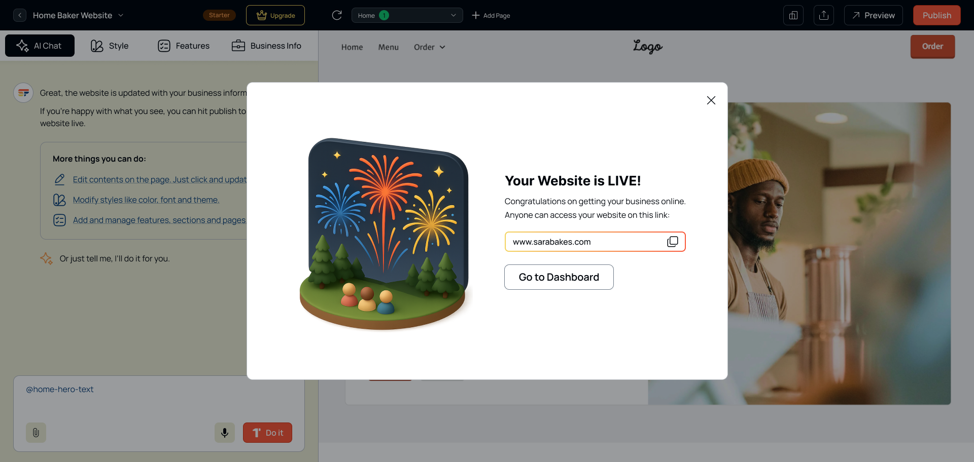
From the waitlist page to the moment a site goes live. Click any screen to step through them full-size.
What designing for AI taught me.
Trust is earned slowly
People needed to see the AI’s reasoning before trusting its output. Showing why a layout was chosen made a measurable difference in acceptance.
Undo is everything
AI-generated content felt risky without an obvious way back. Prominent undo/redo was essential to confidence.
Defaults beat options
A strong starting point — even an imperfect one — consistently outperformed showing multiple choices upfront.
Delay the account
Asking for sign-up before people saw value caused drop-off. Moving it to the publish step kept them engaged.