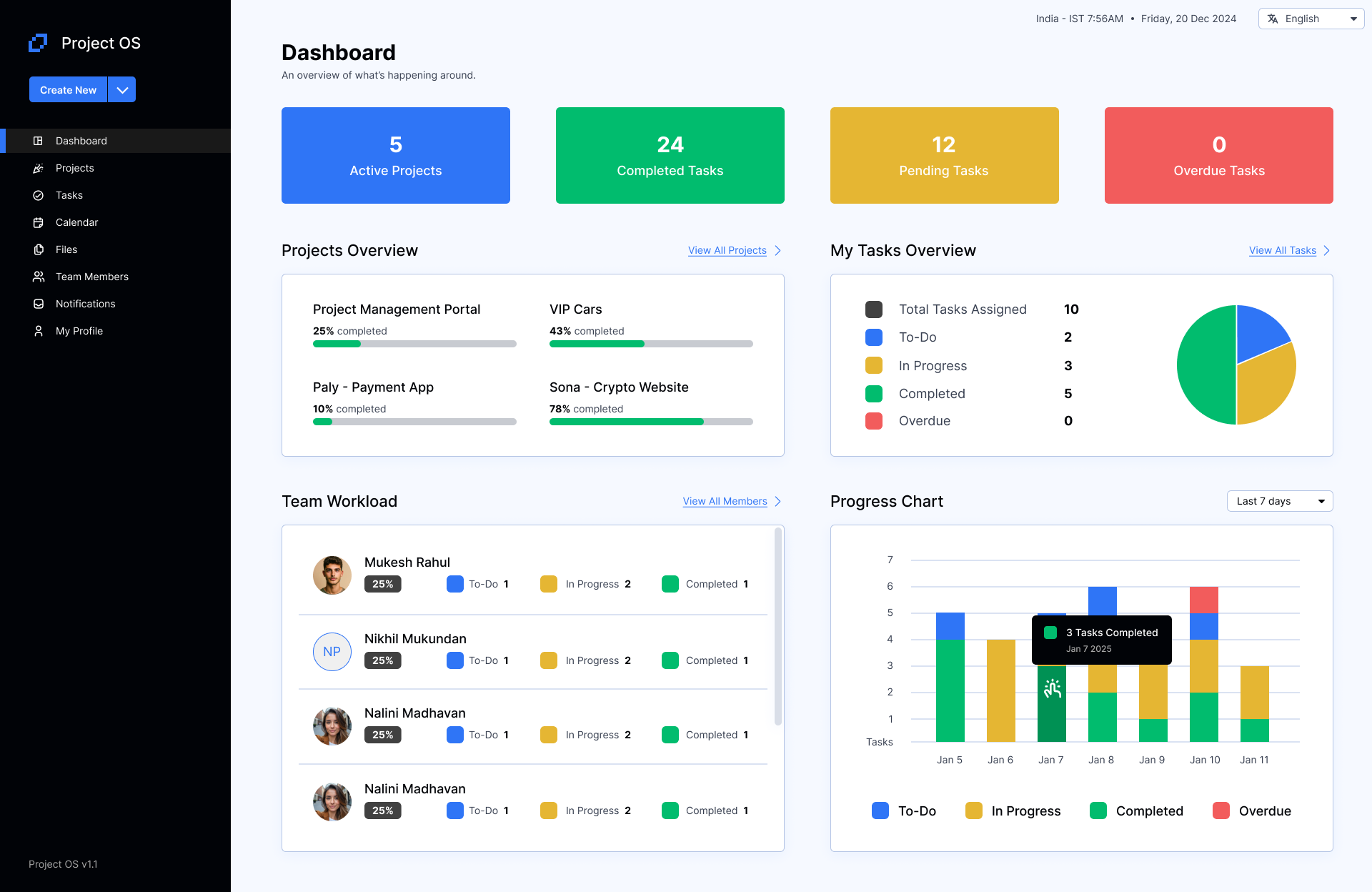
Density without noise.
Dashboards fail in a familiar way: everything is visible, so nothing is. Across projects for operations, HR, finance and compliance teams, I’ve leaned on a handful of rules to keep dense screens calm — the same rules I used to make inventory planning and promotion tracking usable for non-technical teams at Helpful Balance.
Lead with the answer
The KPI that drives a decision sits top-left and largest. Supporting detail comes second.
The right chart, or none
A number, a trend or a comparison each get the simplest form that shows it — sometimes that’s just a table.
Colour means something
Colour is reserved for status and categories, so a red badge always means “look at this.”
Scannable rhythm
Consistent cards, spacing and alignment let the eye jump straight to what changed.
Twelve interfaces.
Click any interface to view it full screen and step through the set with your arrow keys.